 |
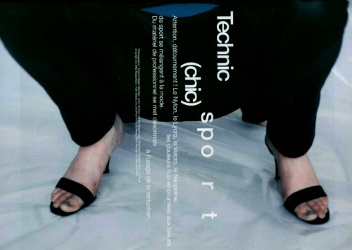
| Jalouse n°7 january 1998 “Technic Sport (chic)” photographed by TIziano Magni |
I'm really into this photo and type. I wonder, though, why they decided to make the sport so unreadable - was it to draw attention to the fact that it's a sportswear spread? Or does the spacing between the "spo" and the "r__t" draw attention to "spo" (what?)? Are we supposed to read "sport" slower? Probably. And I like the (chic), like it's an aside, or like it's only there for people who aren't in the know to realize that sportswear is (chic), like it's there ironically.
I want to start incorporating typography into my designs. See where I can go with it. I started putting random strips of artist tape in my journal to see how I decide to write around it. It looks pretty cool.
No comments:
Post a Comment